Wednesday, 28 September 2011
Sunday, 18 September 2011

Saturday, 17 September 2011
Peer Reviews 3 - Stop-motion Drawings & Videos
Hamish Bulmer - http://hamisharchitecture.blogspot.com/
Hamish looked into the theme of 'gathering' as a place to discuss/share/gain ideas. He developed this theme through his office for the 5 different occupations, situated close to Vector Arena. Hamish's stop animation was a journey of his design mindset. I found it difficult to follow as parts of the video were quite jumpy. However Hamish led me through his stop motion video in detail and explained his ideas and developments which helped me a lot to understand his video. In his video, he looked at the site of the building, the space and several layouts for his office. Things of interest in the video includes a mid video realization that the space he needed to design was much larger than he had imagined. This followed with Hamish's redevelopments of his office idea, and furthermore to his finished design. I was intrigued with Hamish's depth of design, in which he gave a lot of thought about what "real gathering of ideas is". Hamish also gave me a lot of advice on stop-motion videos. Overall I enjoyed crit-ting Hamish's design as it helped me to understand better of the stop-motion workshop.
Note: a link to Hamish's video will be uploaded as soon as he has uploaded it.
Bernadette Fok - http://www.berniefok.blogspot.com/
Bernadette's office occupants include an architect, a structural engineer, a construction manager, accountant and marketing director. Bernadette drew inspiration from La Tourette Monastery by Le Corbusier, where she looked at the enclosed courtyard as a similar feature found in Te Tao Reserve. Bernadette's design also had an enclosed courtyard but she developed it with one side open and the opposite side a lobby where she allowed public access for pedestrians to walk through. I was delighted with Bernadette's stop-motion video as it was easy to follow and was clear in expression. Bernadette included complete drawings of her building, including floor plan, section and final rendered, which where also helpful to me to understand her building. Some of the design features she included was a entire set of wooden louvers along her glass panels which I thought created a subtle but interesting facade. Overall I enjoyed crit-ting Bernadette's design as it was very well thought out and comprehensive.
Campbell Taylor - http://ctay673d2.tumblr.com/
Unfortunantely Campbell already left the crit after I finished crit-ting Hamish and Bernadette. Also the link for his stop-motion video did not work.


Construction!
I finally got my laser cut pieces. Costed me $20, not too bad huh.
I guess its time to rip out the uhu and glue it all together...
I guess its time to rip out the uhu and glue it all together...
Oh, I wished it was that straightforward, I spent almost 2 hours trying to figure out where each piece goes and how my design would fit together. I also realized some miscalculations of the pieces, which meant I was going to get some of my pieces re-cut. However I managed to put the majority of my design together.
Now it was the time for gluing.
Masking tape was brilliant to hold pieces together temporarily. It saved me a lot of time as I didn't have to spend ages to hold the pieces together manually while the glue dries.
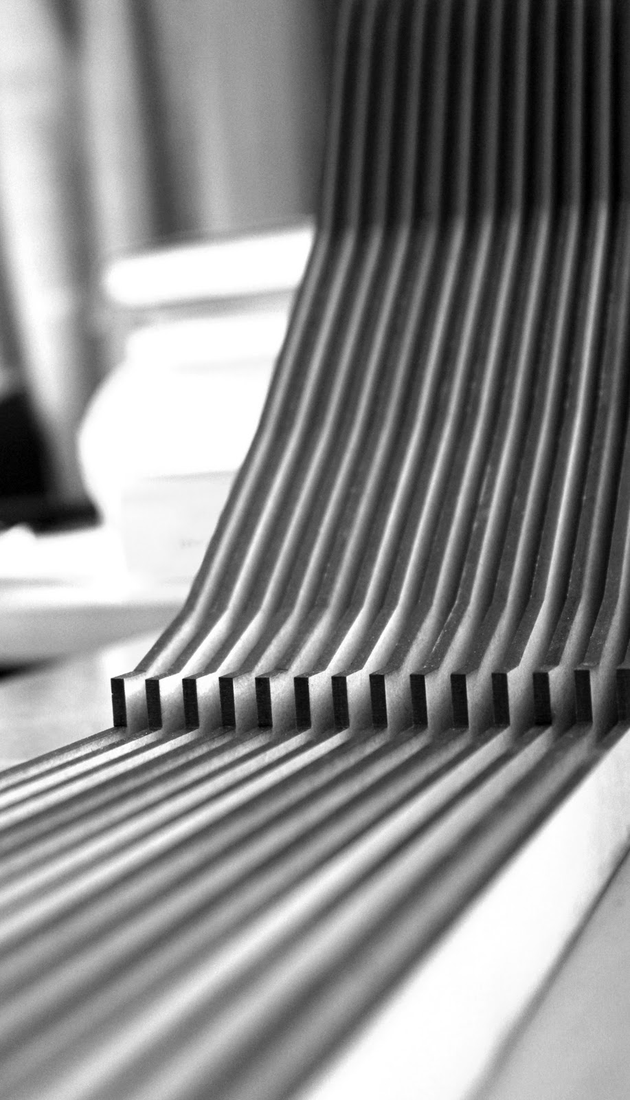
Since I needed to go back and re-cut some of the pieces anyway, I decided to make a contour for my design since it's cantilevered feature was relevant to its surroundings.
Just the contours and the odd shapes costed $65. I made a crucial mistake when I was laying out my contour piece supports, which resulted in me suffering financially. Because of the way I laid out the supports, which were repeated shapes (the multiple crammed horizontal lines) I placed them with gaps in between, which consequently meant There was approximately 30% more cutting, hence I could of saved up to approximately $20 on laser cutting if I had laid them out side by side.
OK, so I learnt my lesson in laser cut positioning. I'm glad to have learnt this early on before I waste anymore money in the future.
After I had completed the contour construction it was time to put the two together.
 |
| The "eyelid" window can be seen clearly in this photo. It was placed there so that the steam from the spa could rise out of the window, without humidifying the rest of the building |
Since I needed to go back and re-cut some of the pieces anyway, I decided to make a contour for my design since it's cantilevered feature was relevant to its surroundings.
 |
| Contours |
OK, so I learnt my lesson in laser cut positioning. I'm glad to have learnt this early on before I waste anymore money in the future.
After I had completed the contour construction it was time to put the two together.
 |
| Using a cup, a tissue box, a calculator and 2 wallets, I managed to hold the cantilever up while the uhu glue was drying. |
 |
| Almost finished ... |
Friday, 16 September 2011
Laser cut drawings!
Using Adobe Illustrator, I began drawing the pieces of my model...


 |
| Majority of building's structure |
 |
| Basketball court cantilever and roof / facade |
The curved line in one of the roof pieces was where I wanted it to be cut so that I could create a "eyelid" on the roof for a window opening. Its hard to imagine so I've included some photos of my concept of an "eyelid" window below.


Note: I've intended the eyelid to be more erect in the final laser cut model
mock-up model
 |
| From the above concept model, I'v developed a mock up model of the interlocking spaces |


I used polystyrene foam to create different room volumes in my first mock up model. Then I covered the polystyrene model with cardboard so that it may be more presentable.


My finished mock up ^
For the final model, I was required to create a laser cut section model, so I drew a section of where my final model section would be cut.

Furthermore, I cut my mock up model at the section line to help me visualize and understand the interlocking spaces of my design.
 |
I guess everyone would look as lively as Rob after a few consecutive all-nighters. :D 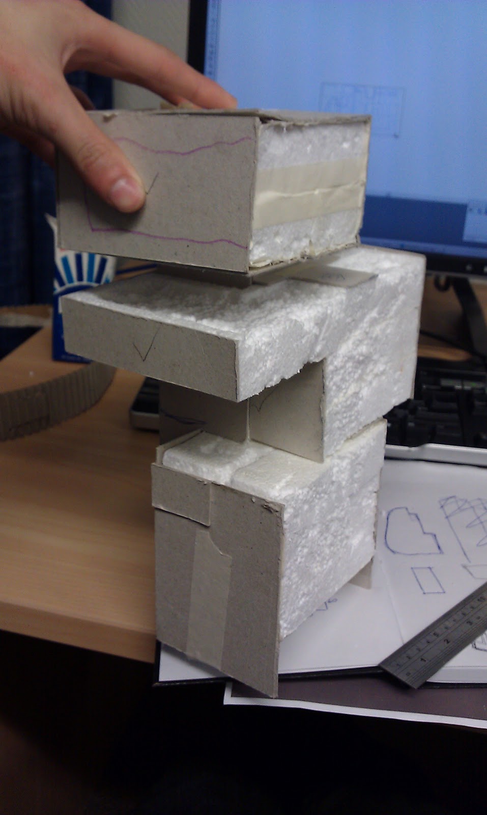 |
Initial ideas/models/sketches
I was initially a bit lost on how my building would include interlocking spaces. I realized imagining and drawing out these spaces were quite a challenge so I made some conceptual models from Tetris blocks and alphabet letters to explore interlocking spaces.


After playing around with the models, I began drawing sketches for my project idea. I tried to create synergies between interlocking spaces building functionality, with considerations of cantilevering part of my design.


Issues + Research + Inspirations
I was having a great deal of trouble thinking how I would include a half court basketball court into my design, as I had a restricted building footprint and I also couldn't let a basketball court "cut through it" (as it would kill the idea of interlocking spaces). I remembered my tutors mentioning cantilevering a floor to provide extra space and I thought that was a great solution since I couldn't place the basketball in the first floor (as prescribed in the brief) and I needed to make the basketball court flow with the rest of the building.


So there I was, looking at some awesome cantilever architecture...


Site
My tutors asked for a site map of where our building would be located, along with references with its interactions with its surrounding environments (e.g. places for food, entertainment, parks, transport) . I've also included photos of the site for visual reference.


 |
| Site seen from Anzac Ave |
 |
| Site seen from Beach Rd |
Wednesday, 14 September 2011
Focus & Clients
My tutor said that the focus to this project is interlocking spaces - how spaces connect with each other. So through care consideration I decided that the following client's brief would make a great interlocking combo.The 5 clients for this project are
Matty - Rock climbing [http://brucekid.tumblr.com/]
Ivrel - Basketball cout [http://itsi relyo.tumblr.com/]
Robert - Jam studio [http://qkrgpwns2.blogspot.com/]
Kmen - Gym [http://kingkongkoh.wordpress.com/]
and me - Spa
Matty's rock climbing would allow my design to engage with vertical interlocking spaces. Ivrel's basketball court would challenge me to find solution to the tiny amount of land given (64m2). Rob's jam studio requested for sound isolation, hence an isolated position, while Kmen's gym linked well with recreational characteristics of my design building.
Monday, 22 August 2011
Gathering - Laser Cutting
I want a open air bathing spa which has interlocking spaces (such as spaces made when observing noobs play in tetris) with the outside but must also not be exposed in terms of privacy. The interlocking spaces must be clearly established in the structure of the building. The spa does not have to be on the roof floor but it cannot be on the first floor.


The dominant material is concrete or stone, which should give similar appeal as the baths above.
Changing rooms and toilets are essentials to the facility.
The idea of a cantilevered spa is recommended but not compulsory


The dominant material is concrete or stone, which should give similar appeal as the baths above.
Changing rooms and toilets are essentials to the facility.
The idea of a cantilevered spa is recommended but not compulsory
Peer Review 2 - Laser Cutting
Charlotte Farquharson - http://chuck--architecture.blogspot.com/


Charlotte's concept in the theme 'sustenance' looked upon the idea of water, and drew into the design of a mobile architecture where people go to collect water. The structure of the building is created from long pieces with jigsaw like joints which allows the building to be able to be disassembled and reassembled efficiently.
I enjoyed Charlotte's idea of having a public water collection space and how it brings back historical rituals of water collection from wells, into the present day scenario. Her design had ambitious forms which gave strong impressions of geometrical shapes, which I found fascinating.
Christopher Ford - http://archicris.blogspot.com/


Christopher's response to 'sustenance' looks at time where he focuses on the changing angles of light created through the different shapes of windows and the rotating gears. Christopher's structual focus is on the rotation of the doors within the octagonal building. His design brought out literal connotations of time such as in Alice in Wonderland.
I was impressed to see mechanics which Christopher used in his design. The door could be manually rotated by a handle sprouted from the gears above the roof. I believe Christopher could strengthen the relationship between time with sustenance in his design. Overall I was delighted with Christopher's design as I found it very visually and mechanically intriguing.
Bryton Pilling - http://brytondesign.blogspot.com/


Bryton's Design approach to 'sustenance' focused on open-source software, a type of software which allowed the user to shape it to whatever the need may be . Brtyon came forth with a design which a shelter, held by flexible pillars where people could walk through and bend at will, hence altering the form of the shelter (yet could hold its form when untouched). He also cleverly used lasercutting to create symmetrical hexagonal holes into his shelter, which resulted in creating flexible properties. I thought that it was a brilliant idea, particularly how the character of open source software complimented with character of the architectural design.
Subscribe to:
Posts (Atom)